Tragic Media recently launched a major responsive overhaul for one of our longest running clients, SportRx. SportRx is an online retailer of prescription eyewear working directly with major eyewear manufacturers to provide the best quality prescription sports eyewear available. Our contributions to their Magento e-commerce platform have helped them reach the top spot in their market space, and are now the largest online prescription eyewear retailer in the US.
Last year SportRx approached us with a need to make their site responsive in order to avoid the new Google penalty for non-responsive websites, as well as to elevate the branding and overall user experience on the site. This redesign was not only a complete overhaul of the design and UX of the SportRx site, but is also teeming with exciting new features for both users and administrators alike. Below is a quick synopsis of how we optimized this beast of a Magento store for mobile.
Where to start?!
This redesign really was chock full of updates and enhancements from the homepage all the way through checkout. Since there are too many topics to review, this article will simply focus on providing a high-level overview of some of the major updates that were made. We will walk through the main pages of the store, following a user through their purchase flow to try and highlight as many of the updates as possible.
Follow us on Twitter and LinkedIn to get alerts when we publish more case studies which will dive deeper into the specificity of the business and marketing needs driving the redesign and how those needs were exceeded by our team.
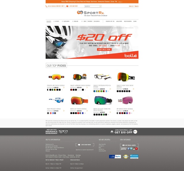
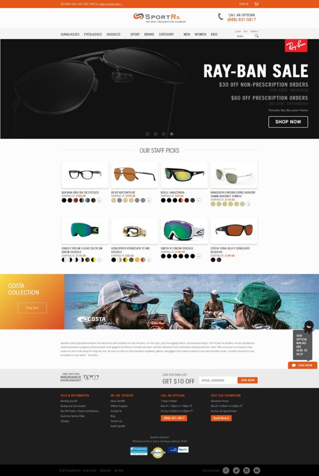
Homepage
We started our efforts on the homepage in order to first setup the overall aesthetics of the new site design, this included reworking the header and footer of the site in order to set the structure for the rest of the pages.
Although most users will enter the site directly on a product listing or product detail page, the homepage is still a very important page for marketing and new product promotions. It is also very important tool for establishing the brand voice and setting the tone for the rest of the user’s experience.
The homepage updates included:
- Creating a custom slideshow extension for easy management of unique slideshows across all of SportRx’s many Magento storefronts.
- Creating a custom promo widget which allows site administrators to easily promote a product or brand in a big feature area above the footer.
Product Listing
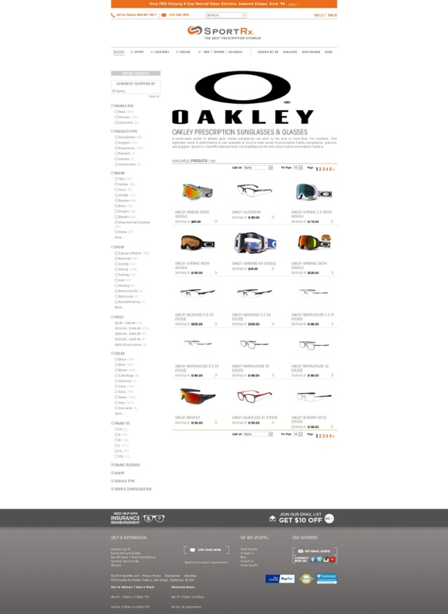
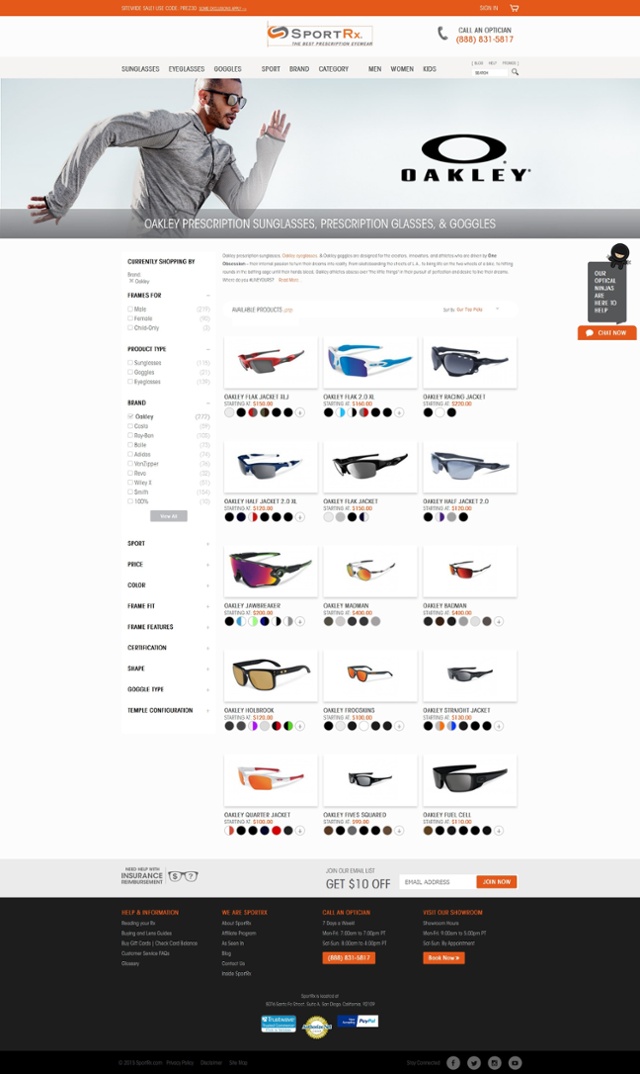
The product listing page also got a feature-rich design reworking. The main purpose of the updates on this page was to make it faster and easier for consumers to filter and find the products that they are looking for.
The product listing updates included:
- Installing the latest version of the Amasty Improved Navigation extension in order to ajaxify the filters.
- Extending a previous custom extension which allows for custom banners and seo copy to be output for each of the Amasty Improved Navigation filters. We adjusted the fields of the existing extension and added some magic so that the banners and seo copy would update with the Amasty ajax filter updates.
- Adding some custom Javascript so that the sidebar filter would tuck away for tablet and mobile for a better browsing experience on smaller devices. This solution was a great example of how we make our sites mobile friendly, not just responsive
Product Detail
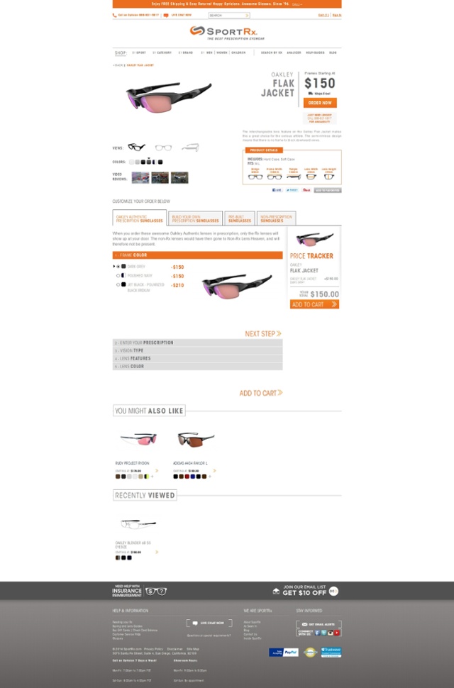
Reworking the product detail was the most intensive task of the entire project. SportRx has a very complicated product customization flow that has a lot of complex blocking logic unique to individual products and brands.
The old store theme used tabs to allow customers to choose different flows of customized prescription lenses depending on whether they wanted to get a pair directly from the manufacturer, a pair from SportRx, a prebuilt pair with limited customization, or a non-rx pair. Although technically sophisticated, it was very confusing, unintuitive, and was a pain point for both users and administrators alike.
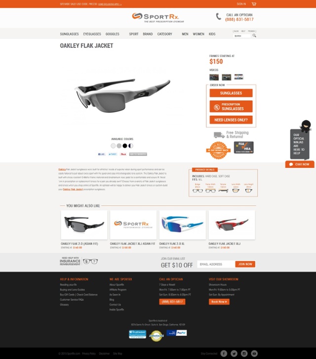
Our designers worked closely with the SportRx internal team in order to rework the page into a smooth flow of choices that would allow the user to easily customize the pair of glasses that they wanted. The existing Javascript logic was completely reworked and the design was updated in such a way that options could be added or removed based on the user’s choices without making the process confusing for them.
Additionally, this new flow was created to be easy and intuitive no matter what device the customer was on. The new product page has all of the same features of the old site, but it feels like a completely new, and better, experience across all devices.
The product detail page updates included:
- Complete overhaul of the product customization layout and logic.
- Addition of new product features
- Reworked how a user adds their prescription to a product
- Lots of complicated mobile and tablet responsive work
Checkout
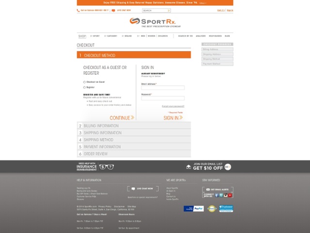
Despite having invested a lot of time and money into advanced customization and integrations into the store, SportRx was still using the default Magento one page checkout previous to the responsive redesign.
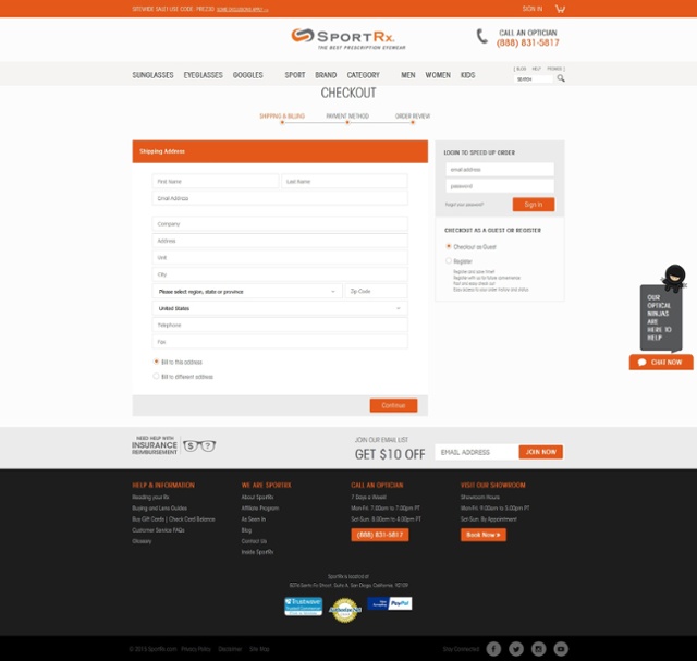
The SportRx team asked our designers to come up with an intuitive checkout flow that would be simple for users to use on all devices. This was a serious challenge, because while a one page checkout is great on mobile in theory, the abundance of fields stacked all in a row creates an overwhelmingly long page on smaller devices.
We opted to create a 3-step ajax driven checkout which was modeled on top of the Magento one page checkout. This allowed us to save some time as we did not have to recreate the entire checkout process, but rather focused on reworking the existing one page flow to work in a quick and easy 3-step setup. The result is a beautiful checkout experience (Note to Rich: This needs to link to an article or post specifically about the checkout with analytics data) that is easy no matter how you are browsing the site.
The checkout updates included:
- Reworking the default Magento 5-step one page accordion checkout into a smooth ajax-driven 3-step checkout
Conclusion
A great website doesn't just happen. It is born from the minds of talented digital artists working closely with user experience experts to create an interface that is both new and familiar all at once. This vision must then be meticulously executed by expert developers to bring it to reality. Tragic Media is dedicated to taking our clients' digital presence to the next level. Our approach is to work closely with internal teams to translate internal business strategy and marketing goals to tangeable digital enhancements built to elevate qualified traffic, engagement and conversion. Contact us today to learn more about what we can do to help you build your digital brand.

