Like a construction worker wouldn’t build a house without a blueprint, a designer shouldn’t dive into the visual (UI) design without a wireframe. It’s extremely difficult to design an application on the fly. Even if you know all of the components needed to create it, a lack of upfront planning guarantees that steps will be skipped, mistakes will be made, and extra work will be invested, which wastes resources and money in the long run. Applications don’t come together on a whim and involve a lot of moving parts like multiple user roles, admin needs, and interface outlines for mobile, desktop, and web. Additionally, designs must be forward looking and plan for how the application will scale over time. This means they require a holistic view of the project involving the input of stakeholders like leadership, marketing, clients, sales, and development.
To ensure the best final result, you need wireframes to lay the foundation for the design process. This article will discuss what wireframes are used for, how they improve the application design process and why they are crucial to any design project.
What is a wireframe?
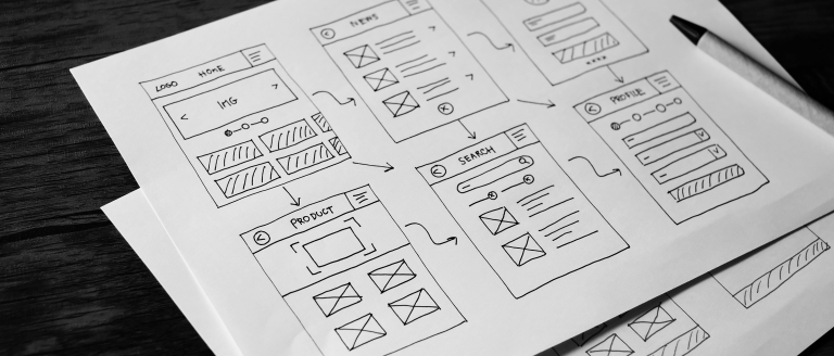
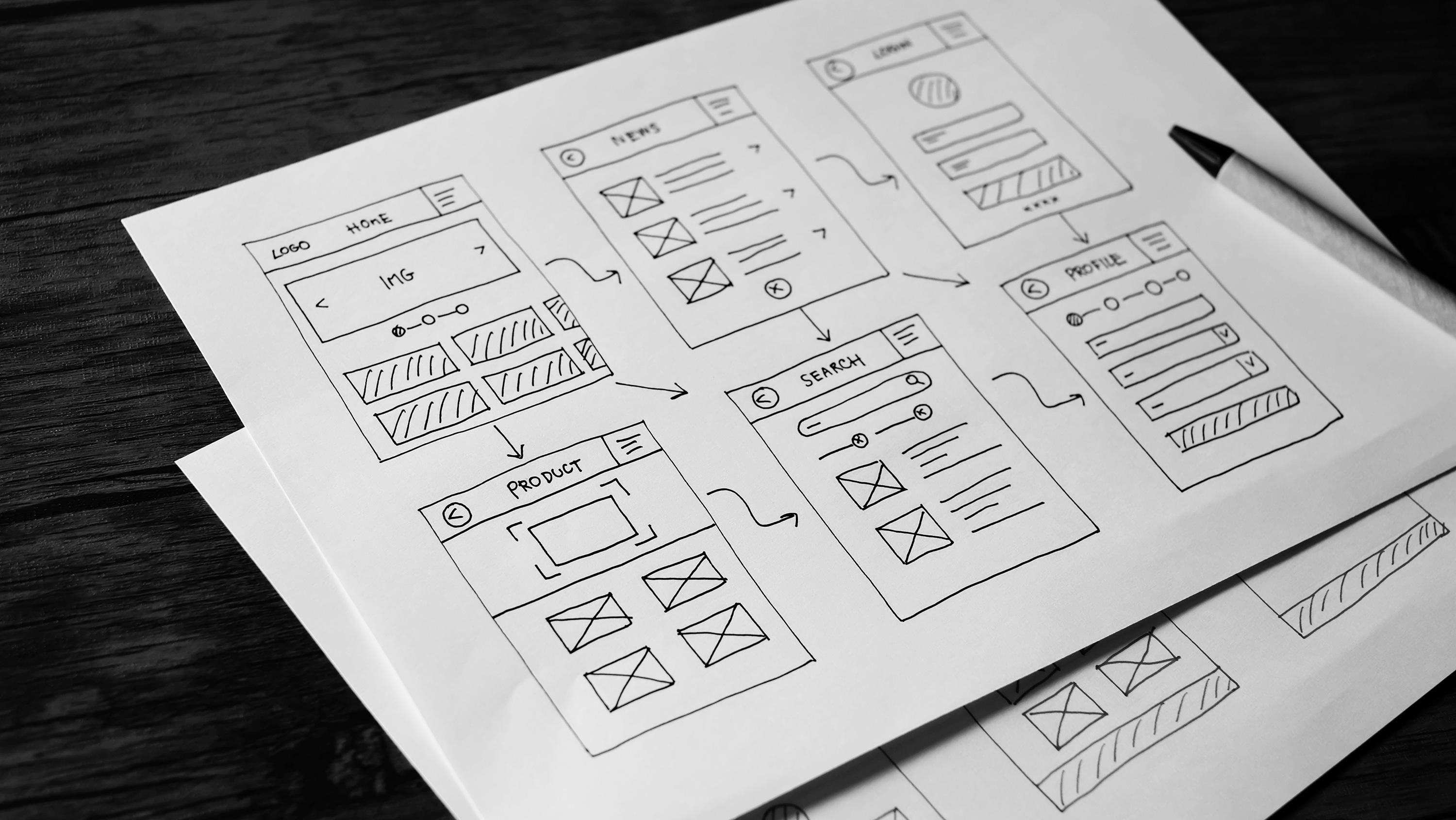
A wireframe is a blueprint that outlines layout, features, and user flow for an application or digital project. It’s a useful tool to avoid making key mistakes as it allows stakeholders to focus on the general outline and flow of data instead of being overwhelmed with opinions on the visual execution. Wireframes also allow for rapid iterations with minimal effort invested, and can be created with pencil and paper, a word document, or a wireframing tool. Wireframes align everyone involved in the design and development process on the requirements and proposed solution. At Tragic we like wireframing with Figma as it is collaborative and allows for easy transition into the User Interface (UI) design. Ultimately, it doesn’t matter how your wireframing is done as long as they’re documented so that everyone involved in the process can access and discuss them.
What is User Experience (UX)?
UX is how a user feels when they interact with a product. A good UX will bring users joy and solve their problems effortlessly. Wireframes play a central role in defining the user experience (UX) of your product because you can use them to map out your customer’s journey on the interface. Whether you want them to achieve certain goals, like creating content or interacting with a dashboard, a wireframe is the blueprint for how they will get there and what steps they will take to accomplish their goal. Without a clear outline of what you want your users to achieve and how they’ll do it, it’s difficult to ensure your customers will achieve what they need without roadblocks.
Because it is grey and simple, a wireframe limits distractions associated with color schemes, fonts, and pictures that have little impact on the user’s satisfaction with how the product solves their problem
Why are wireframes important?
The design process has a long laundry list of features, stakeholders, team members, and different experience levels that all need balance. Wireframes are important because they avoid conflicting opinions from the various individuals involved in its development by keeping everyone aligned with the project’s goals, user personas, and processes. Whether it’s an application or a website, a design project consists of numerous people, all with different expertise, and each person may see a different way to approach the building process. Without instructions to clearly outline the processes and goals of the project, the direction can go south quickly and lead to a disaster.
They facilitate necessary outlining and brainstorming.
Rough drafts that can be marked up and evolved quickly are a necessary tool throughout the application development process. Sometimes you might fully develop a feature only to throw it out and rebuild it because it’s not what customers need or want. Failure to brainstorm, research, test, and validate your assumptions wastes time and extends deadlines. Wireframes help avoid these mistakes by aligning a product’s vision with best practices through rough drafts and brainstorming solutions that can be tested before any development is done.
They provide a holistic view of your user experience
In the development process, your biggest focus should be on it working properly, not how it looks. To ensure this, wireframes keep the product's goals at the center focus and allow everyone in the development process better understand how customers and clients are navigating the product. A wireframe displays the application’s features and flow visually without opinion-based UI design elements. Because it is grey and simple, a wireframe limits distractions associated with color schemes, fonts, and pictures that have little impact on the user’s satisfaction with how the product solves their problem. With wireframes, you can focus on product market fit and ditch the UI design elements that don’t indicate how the product functions.
They create scalability.
Wireframes offer a holistic view of the application and provide insight on where new features could be added in the next iteration. They also allow for pivots to be made ahead of time before effort is spent in the user interface or development. This avoids last minute changes that cause headaches, wasted time, and could push back deadlines for the design or development team.
They bring all departments together to understand the vision.
Wireframes fuse the goals of leadership, marketing, sales, and development teams into one vision. This eliminates design distractions and focuses on content around usability and conversion paths. They provide the opportunity for stakeholders from multiple departments to align and ensure the right problems are being solved.
They save time.
The easiest way to change an idea or feature is when it is in outline form in the wireframe.
Wireframes mitigate miscommunication and, ultimately, save you time and energy in the web design process. Designing takes a lot more time than wireframing and development takes even longer. Redeveloping features can be time-consuming, frustrating, and push back deadlines significantly. Changing something after it has been developed creates a much larger loss of time than changing it when it is simply an outline on paper. Investing in the wireframing process is exactly that, and investment to prevent lost time in the future.
They outline user flows.
Creating a step-by-step flow of how your user navigates an application and reaches their end goal is a valuable part of the wireframing process. Not only does it visualize the pathways a user might take, but it also aligns the development team on exactly how a feature or flow needs to work. By wireframing user flows in detail, you can use wireframes to highlight potential issues and map out alternative steps for the user to take.
Steps to start wireframing
Wireframing can be as simple or as comprehensive as you need it to be. No matter how you choose to approach your wireframe, its main purpose is to provide a clear map of what your application is and how users will utilize its features to solve their problem. To maximize your wireframing process, follow these primary steps to start a wireframe:
- Choose your tool: Whether it’s pencil and paper, a Google document, or a software tool, the wireframe should be accessible to everyone on the team so that everyone can outline thoughts and stay on brand with the application’s goals. Popular professional tools include Figma and Adobe XD.
- Outline features: After choosing a wireframing tool, the next step is to know what the product is going to do and what features are offered. Here you can outline the primary features of the application and what problems it solves.
- Establish and separate user roles: Once features are outlined, you’ll want to align those features with the problems of who is using your product, what their goals are, and what features they have access to.
- Map out constraints: Limitations could be based on the platform you are building with, the UI framework, timeline or budget. Be mindful of these limitations ahead of time so that you can explore solutions early in the design process.
Conclusion
There’s no rule to how much time you should spend in UX vs UI, this is mostly dictated by the design and development team’s preferences, and is also heavily dependent on management’s investment and timeline. No matter how many are produced, a wireframe should be well thought out and seen by all teams working on the project. Wireframing is an essential part of developing a strong user experience and a delightful product. Wireframing should include some form of brainstorming, team alignment, perspective on UX, and scalability. Wireframes are an absolutely critical part of the design and development process and should never be skipped.

